" transform="translate(0 6.875)" width="14px"/><path d="M 0 14 L 0 0" fill="transparent" height="14px" id="kdPOuS2o3" stroke-dasharray="" stroke-linecap="butt" stroke-linejoin="miter" stroke-miterlimit="10" stroke-width="2" stroke="rgb(255, 255, 255)" transform="translate(6.875 0)" width="1px"/></svg>)
Overview
Summary
DriveBuddy was a school project at Langara College’s Web and Mobile Design and Development postgraduate diploma program for Spring 2024, where team Cre8 worked collaboratively through Agile framework to design and develop an MVP web application.

The Challenge
Drowsy driving is a serious safety risk, contributing to 21% of vehicular accidents in Canada, resulting in about 2,100 serious injuries and 400 fatalities annually. Fatigue slows reaction times, impairs focus, and affects judgment, making it one of the top three causes of collisions in the country.
For industries requiring long driving hours, such as long-haul trucking and ride-share services, this risk is even greater. For companies, this leads to:
Driver safety concerns
Productivity losses
Delivery delays
Higher insurance costs
Potential liabilities
Without proper monitoring, companies struggle to identify and address these risks before they escalate.
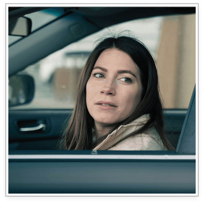
The Solution
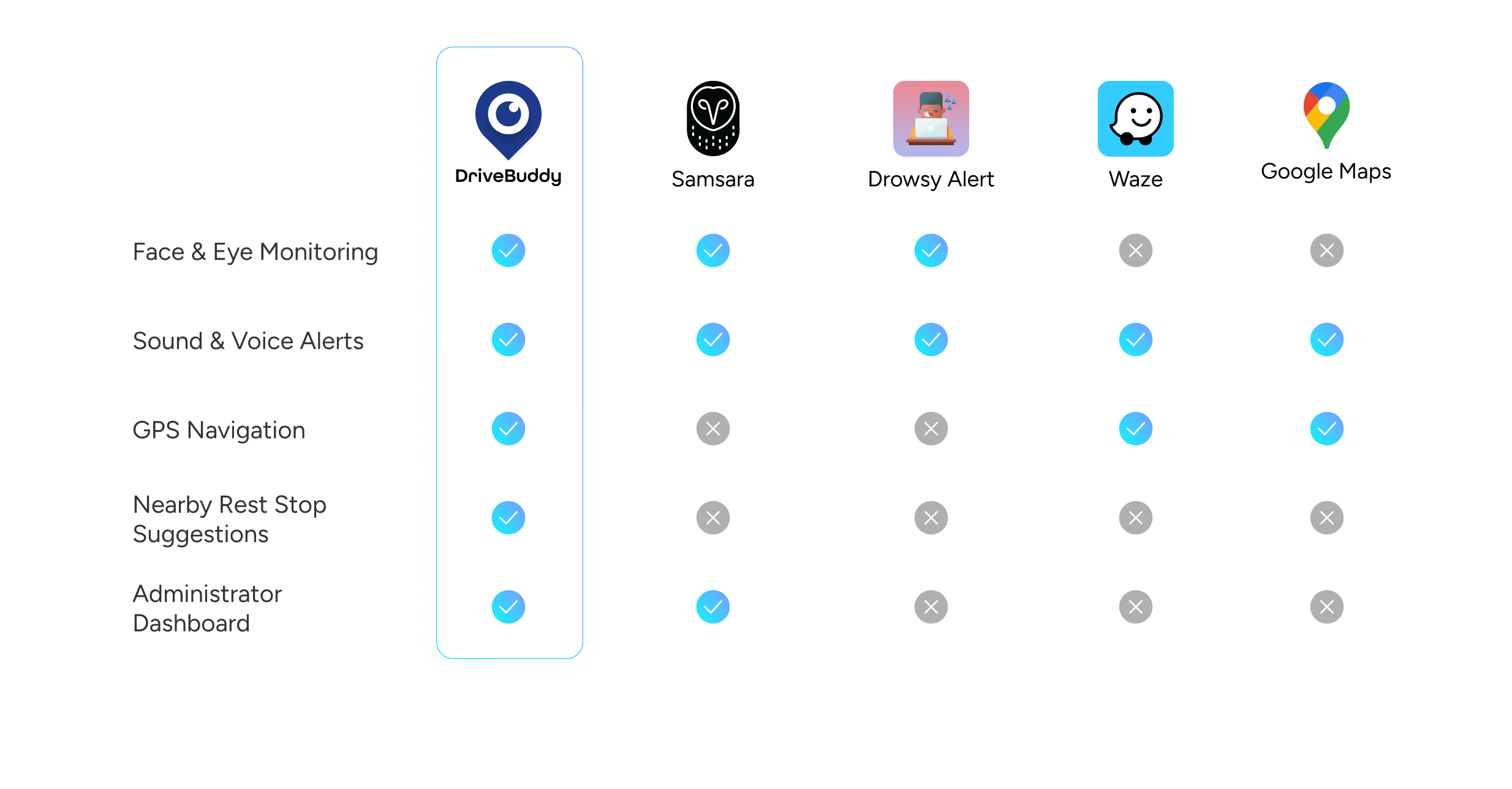
DriveBuddy is an AI-powered mobile app designed to help drivers stay safe by detecting early signs of drowsiness. Face and eye monitoring technology tracks signs like frequent blinking or closed eyes. Instant sound and voice alerts notify drivers when signs of fatigue are detected. Nearby rest stop suggestions encourage timely breaks to recharge. Administrator Dashboard provides real-time insights into driver safety, alerting companies to potential risks before they become incidents.
Impact
By combining proactive safety features with practical support, DriveBuddy:
Reduces accident risks
Promotes driver well-being
Empowers companies to manage fleet safety effectively
Improves operational efficiency
DriveBuddy makes roads safer — for drivers, companies, and everyone.
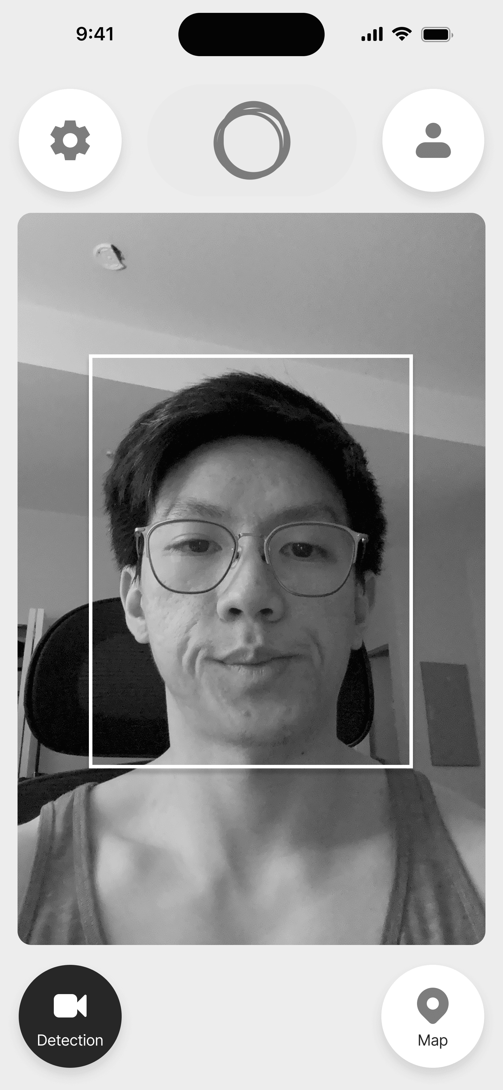
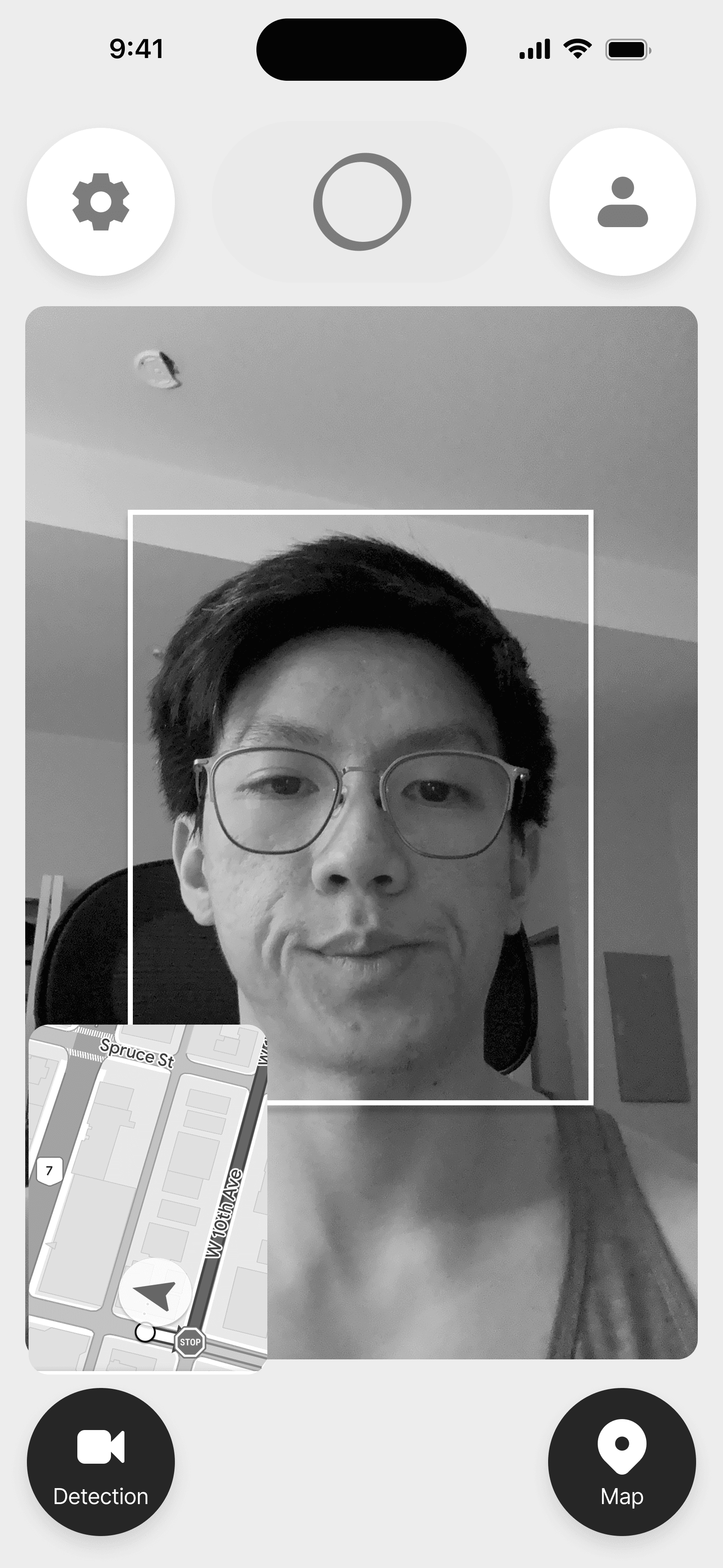
Face and Eye Monitoring
Uses AI and machine learning to monitor a driver’s face and eyes in real-time to detect signs of drowsiness such as eyes closed for extended periods, or frequent blinking which are natural responses of drowsiness.
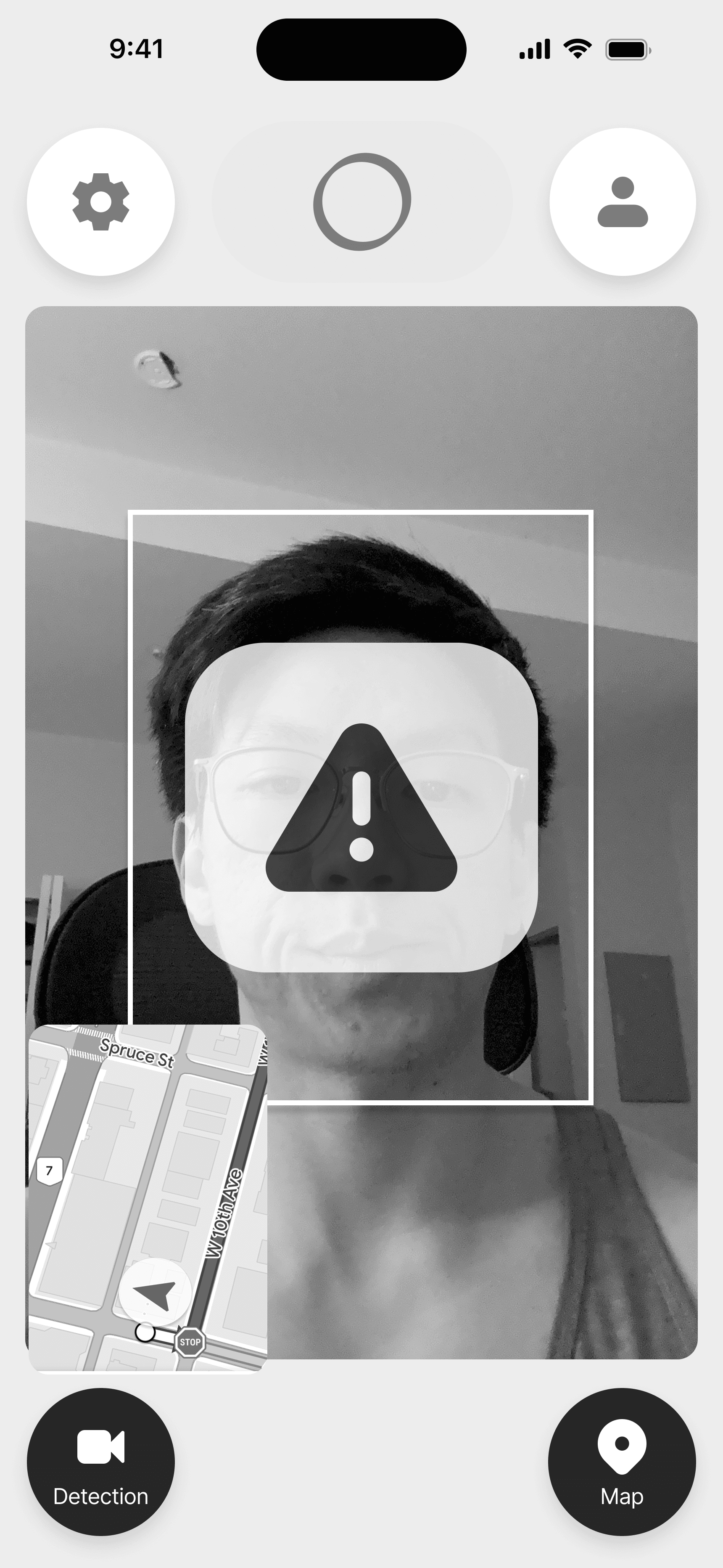
Warning
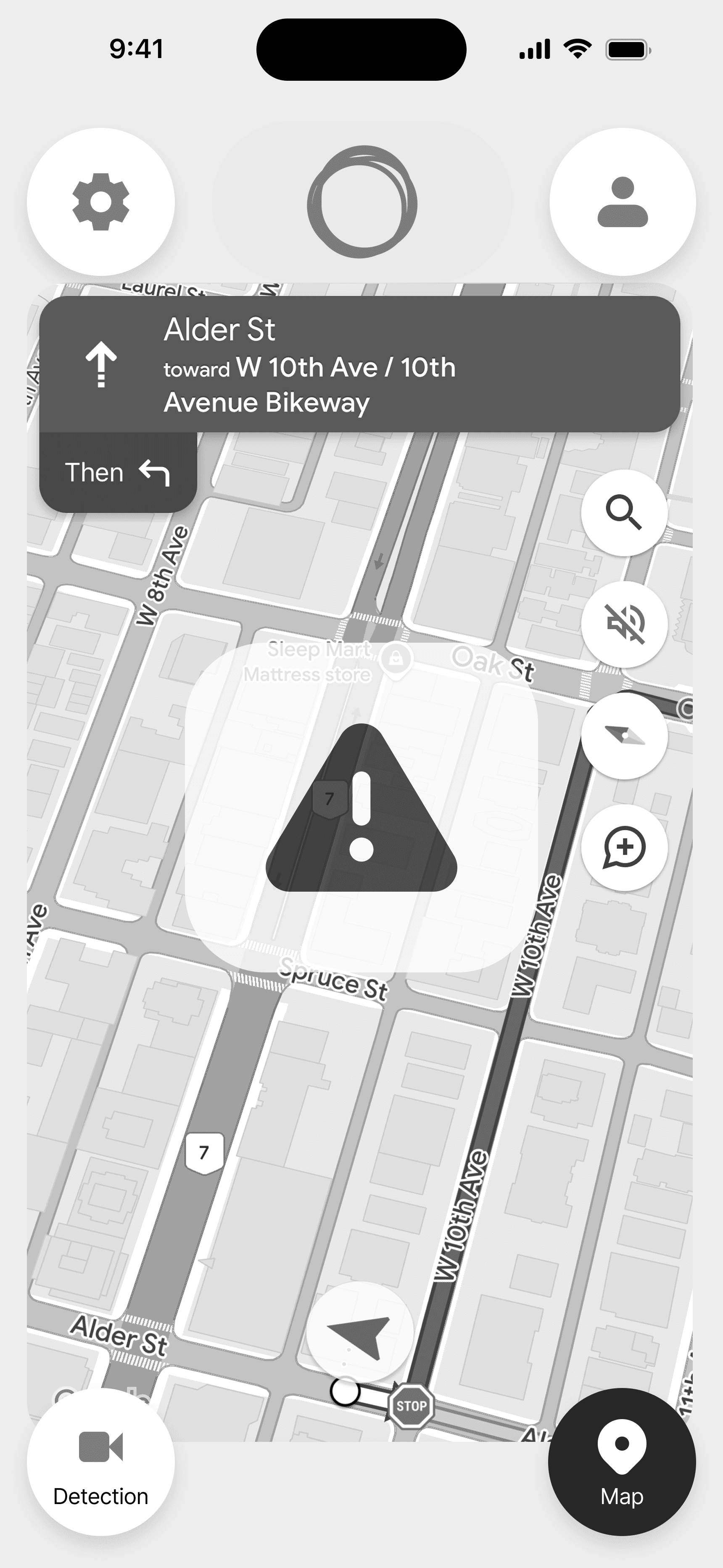
Sound and Voice Alerts
Delivers sound and voice alerts when sleepiness is detected, helping drivers to keep awake without being disruptive.
REST AREA
2 KM
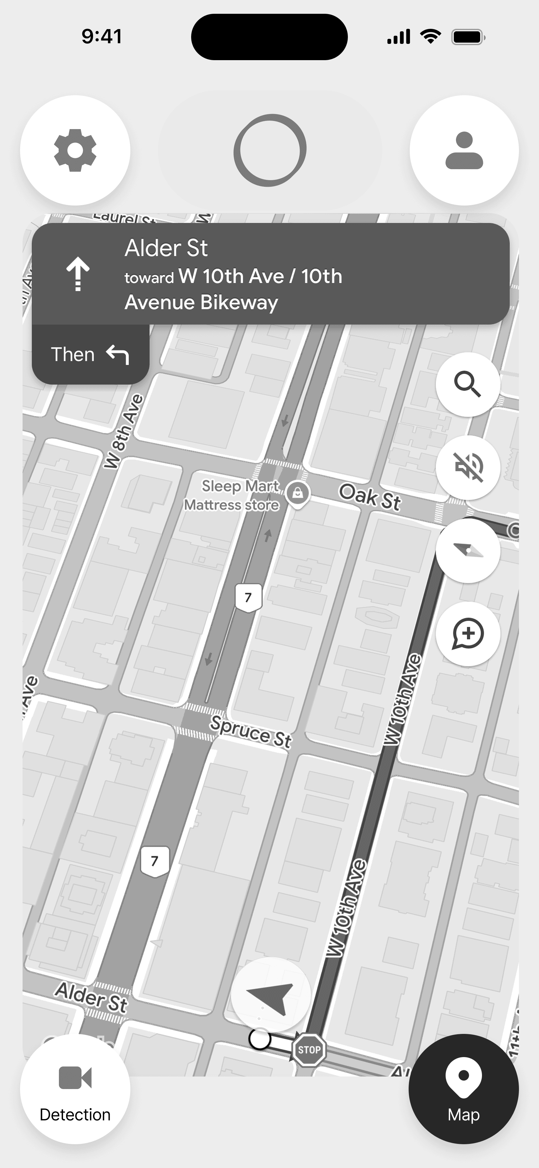
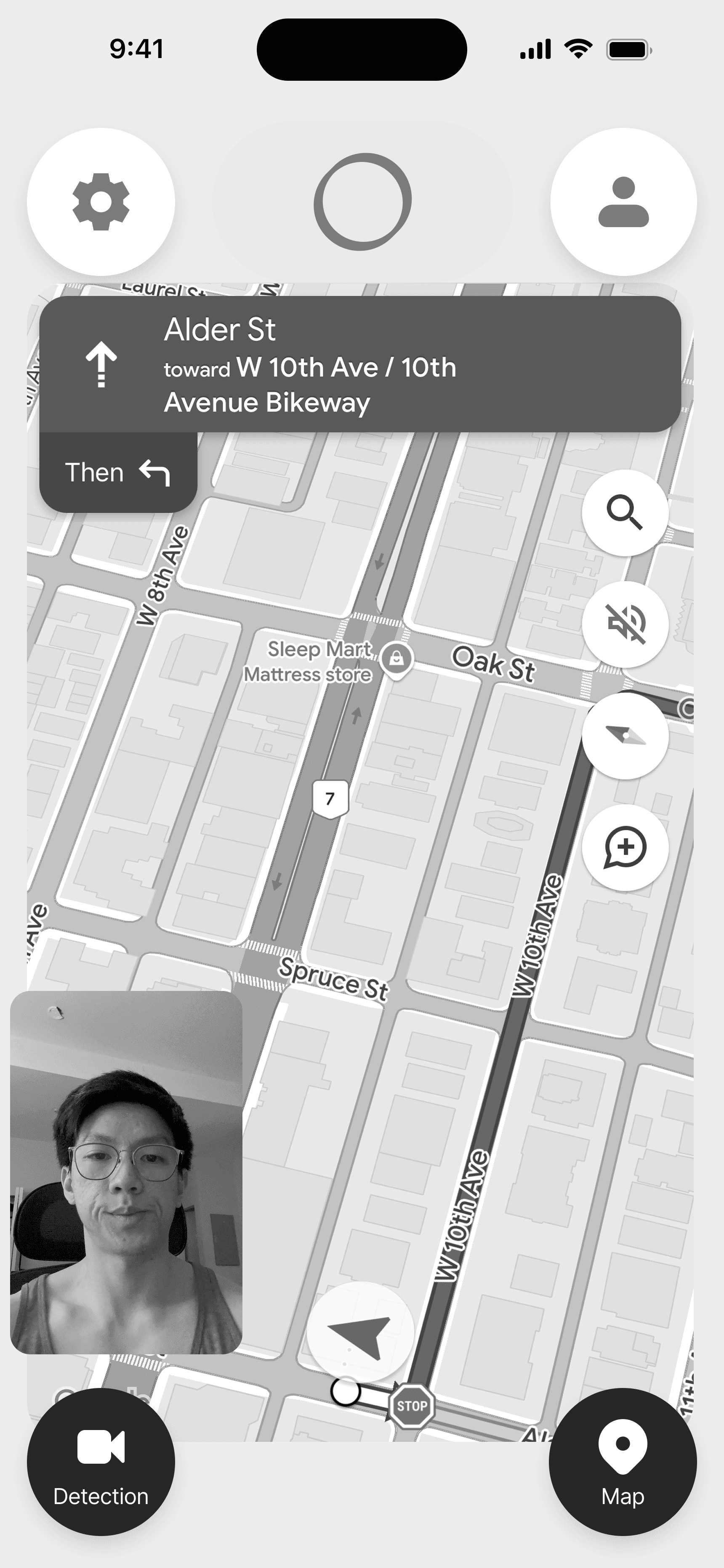
Nearby Rest Stop Suggestions
Suggests nearby rest stops such as gas stations, rest areas, and other places where drivers can take a break, grab a coffee, and recharge.
Dashboard
Manage drivers
Profile
Log out
Average driver
Day
Week
Month
Year
Oct 1, 2024 - Oct 31 2024
Driving hours overview
360
hours with detection
5
alerts received/hour
28
most alerts received by one driver
23
Total
4 alerts received/hours
Oct 31, 2024
Alerts received/hour
Individual report
Day
Week
Month
Year
1 - 11 of 57
Oct 1, 2024 - Oct 31 2024
Driver
Hours driving
Alerts/hour
Taylor Swifty
42
5
Anne Hathaway
35
3
Harry Porter
20
2
Lady Gaga
45
1
Micheal Jackson
36
0
Katy Perry
36
0
Takahana Ohama
36
0
Junjutsu Kaisen
36
0
Demon Slayers
36
0
Blue Eyes Samurai
36
0
Arcane
36
0

Administrator Dashboard
Allows companies to monitor their drivers’ safety and well-being, providing insights such as drowsiness alerts to help identify potential safety risks before they escalate.
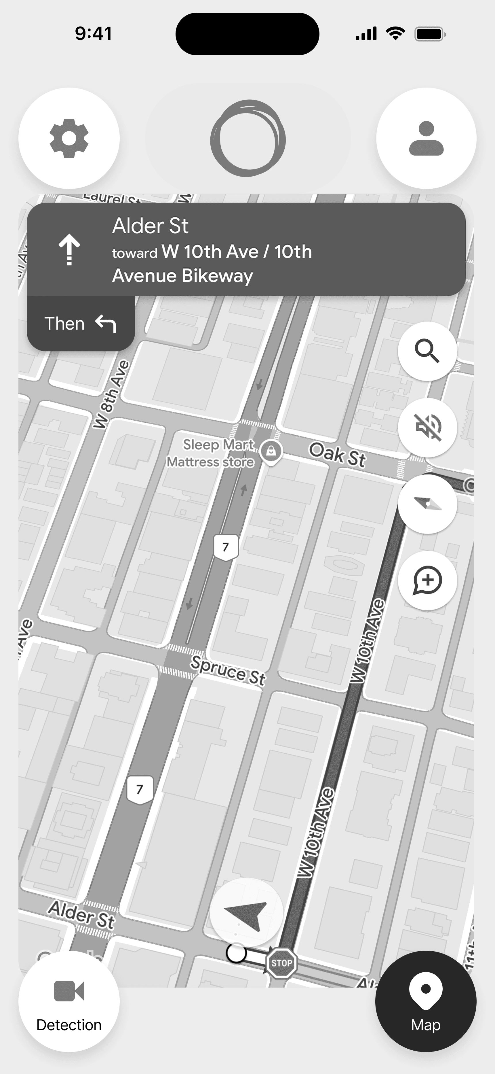
GPS Navigator
Displays the driver’s current location on the map, and suggests the best route to reach their destination efficiently, ensuring they stay on track and avoid unnecessary detours.
Demo
Empathize
Personas
We kicked off the design process with understanding our users.
Creating user personas was key to shaping DriveBuddy’s design. By identifying key user needs, frustrations, and goals, we ensured our solution addressed real pain points for both drivers and fleet admins. This guided our design decisions, keeping the app practical and effective.
Jack Thompson
Age:
Occupation:
Location:
45
Long-haul truck driver
Vancouver
Jack Thompson spends 10–12 hours daily on the road, navigating long stretches across states or countries. With years of experience under his belt, Jack is highly skilled but finds the job both physically exhausting and mentally draining due to its demanding nature.

Habits
Maintains strict driving schedules
Often drives at night
Relies on coffee and energy drinks to stay alert
Needs & Goals
Maximize safe driving hours
Reduce fatigue-related risks
Easily locate convenient rest stops with truck parking
Frustrations
Struggles to stay alert on monotonous routes
Difficulty finding safe rest stops
Frustrated by tools requiring constant manual input
Sarah Less
Age:
Occupation:
Location:
34
Full-time ride-share driver
Vancouver
Sarah Lee juggles 8–10-hour shifts, often late into the night, with the responsibilities of raising two young children. Tech-savvy and efficient, Sarah depends heavily on apps for navigation, earnings tracking, and maintaining her customer ratings, making technology an essential part of her daily life.
Habits
Uses playlists and podcasts to stay entertained
Prioritizes passenger safety alongside her own
Prefers engaging features to combat fatigue
Needs & Goals
Stay alert to ensure passenger safety and satisfaction
Plan efficient rest breaks between rides
Avoid accidents to prevent financial losses
Frustrations
Struggles with reduced focus during late-night shifts
Balancing safety with maximizing earnings during busy periods
Finds traditional fatigue-monitoring tools intrusive or unreliable
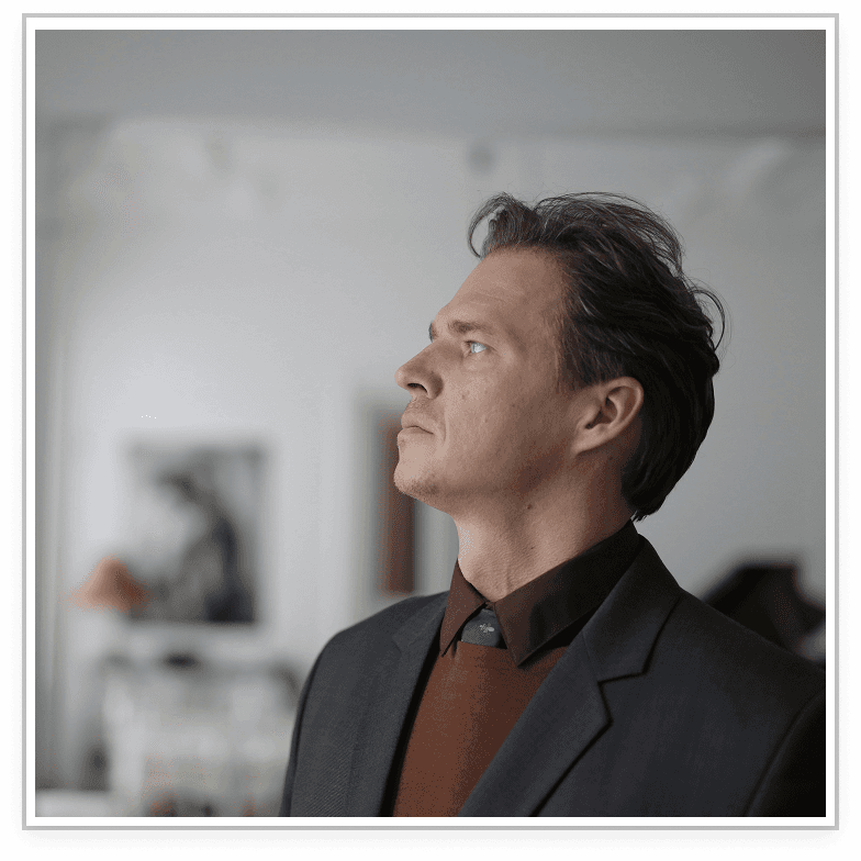
Mark Levis
Age:
Occupation:
Location:
45
Fleet Operations Manager
Vancouver
Mark has over 15 years of experience managing a team of long-haul truck drivers for a mid-sized logistics company. He’s responsible for ensuring deliveries are made on time while prioritizing driver safety and well-being. With his busy schedule, Mark relies heavily on data and reporting tools to make informed decisions quickly.
Habits
Monitors driver performance and schedule efficiency
Balances managing operations with meeting delivery deadlines
Relies on data dashboards to track productivity and costs
Needs & Goals
Maximize manpower by assigning the best-suited drivers for each route
Reduce costs by improving scheduling efficiency
Mitigate accident risks
Frustrations
Struggles to find solutions that integrate smoothly with existing systems
Pressure to prioritize delivery targets while ensuring driver safety
Competitor Analysis
With the findings from our design thinking workshop, we were able to come up with 3 main features to help our users. We gathered research of competitors with similar product offerings to see how we could stand out in this competitive industry.
Define + Ideate
User Flow
Creating a clear user flow was crucial for aligning the design and development teams. It mapped out the app’s core interactions, ensuring developers understood how users would navigate features like fatigue alerts, rest stop suggestions, and the admin dashboard. This streamlined communication minimized confusion and kept the project on track.
Company Admin Flow
With the Exercise Screen flow being connected to both the Training and Learning flows, our team felt this was the optimal approach to both streamline the user experience and allow the user to get the most value out of our product’s core functionality.

Driver Flow
I was mainly responsible for constructing the flow for the Training feature, which was the portal for users to either continue with their personalized program, or choose a premade program which was unrelated to their custom program.
The main priority for me when designing this flow was to allow the user to be able to receive all the information they would need prior to engaging in exercise, as well as the ability to learn or refresh their memory of a particular movement in order to do it safely.

Branding & UI Kit
With the team mood board serving as our north star, we gradually constructed and improved our UI Kit over sprints 4-6. This helped us to maintain consistency and efficiency as we continued to improve and polish our mockups and prototypes. Although we started out with Material UI components for the low fidelity wireframes, we gradually replaced them with our own custom components that fit our product brand.
Prototype
Wireframes
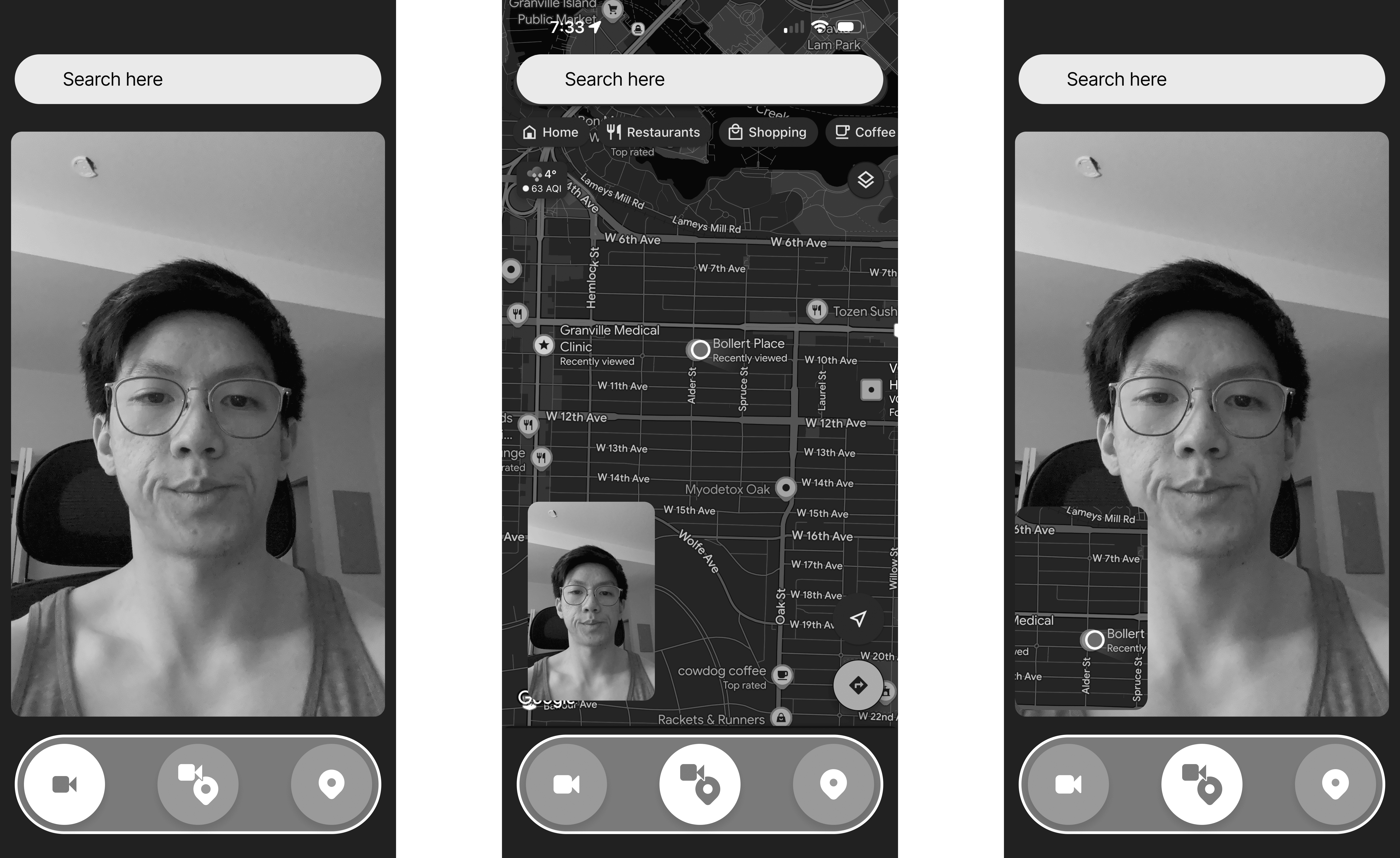
Initial Concept - Option 1
The first concept was a home screen with a CTA to start detection. There is also a overlay which indicates the AI voice assistant.
The main interaction that we focused on was the face and eye detection system, as well as the integration of the map navigation.
For the face and eye detection interface, I felt it was appropriate to borrow the design pattern that users are familiar with when video chatting on FaceTime or WhatsApp. Users see a display of their front-facing camera, which can be shrunken or enlarged. Users can also tap the video to toggle between the camera and the map.
For the map interface, we didn’t want to reinvent the wheel, as most users are most familiar with the UX of Google Maps. The search bar and menu toggle are are the top of the screen.
I tried experimenting with the map sliding up from below, which is similar to how Google Maps works with specific locations.
Initial Concept - Option 2
The second variation is very different from version 1 in that there is always a dock from which users can toggle the map, the camera, or both.
There were some key issues with this idea, in that the user would have to navigate through the flow without clear guidance from the interface, i.e. from a navigation bar, which violates Nielssen’s Heuristics: Visibility of System Status.
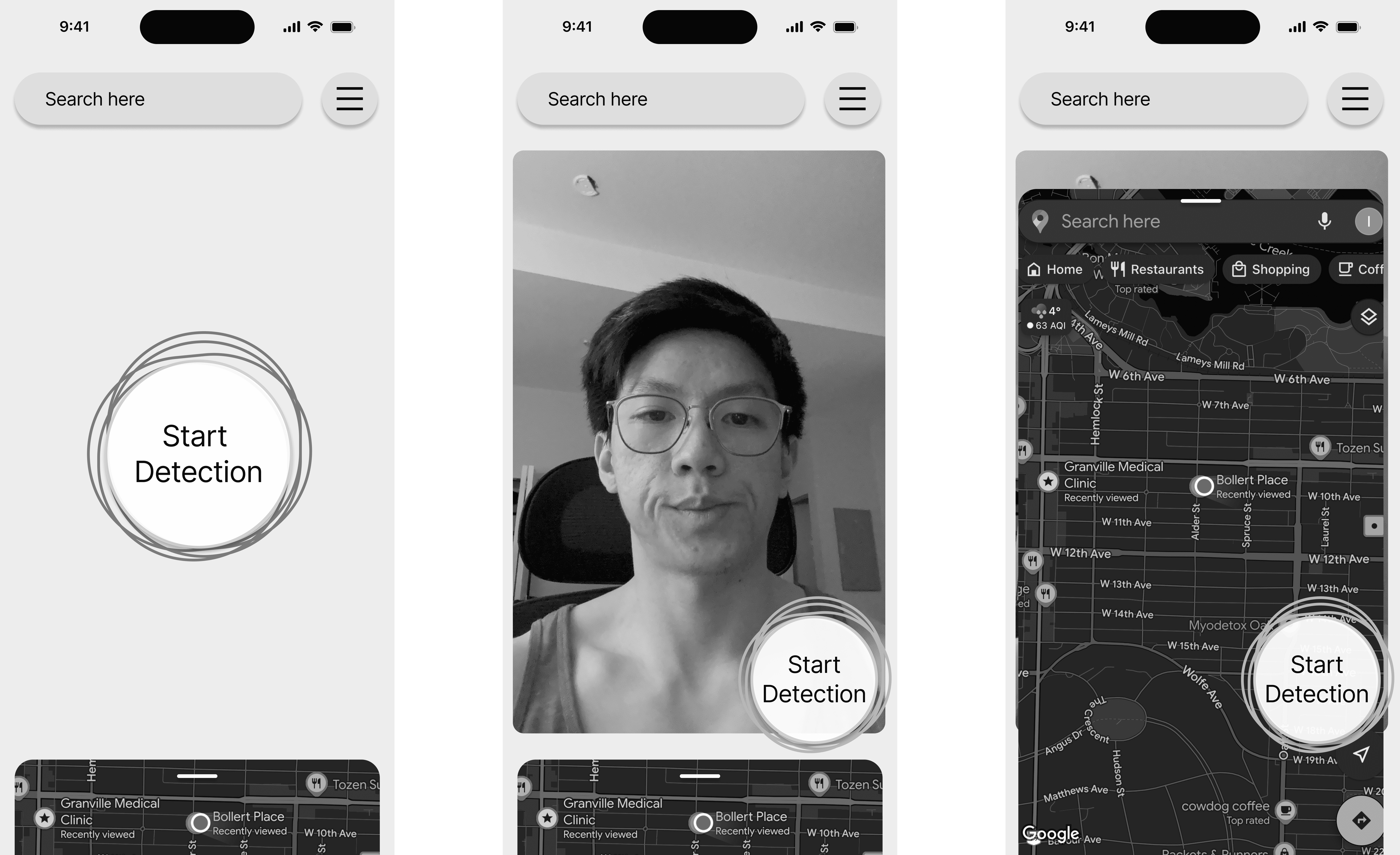
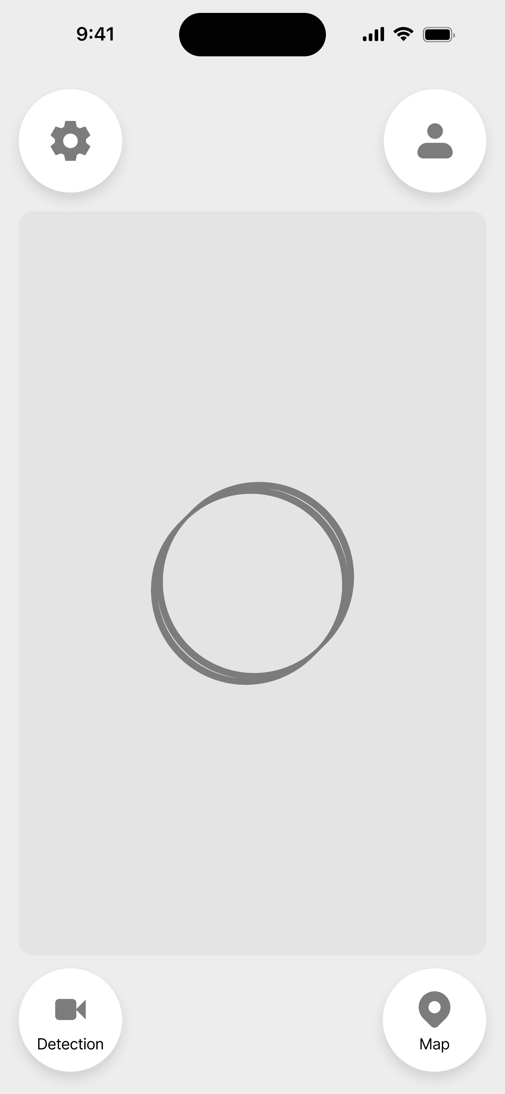
Second Version: 4-Corner Layout
After discussions with the other designers, dev team, and instructors, I attempted a second iteration which combined the strengths of the first two ideas along with some adjustments.
I experimented with having 4 buttons which are always present for the user to interact with. According to BC driving laws, while driving drivers may use an application for navigation purposes as long as each action only requires one touch. The rationale for having a 4-corner layout was to maximize the distance between each button, as well as its physical correlation to the four corners of the mobile device. This minimizes the time for the drivers to recognize which action they want to take, which is of utmost importance when on the road, where we’d want the drivers to be as undistracted as possible.


Originally the buttons were all just icon buttons, but our team decided that having text to accompany the icons would improve the usability of the buttons

Mockups
After the UX was solidified through the wireframes, the next step was to enhance the vibrance of our UI by applying the colors and styling our team established in the branding guide and UI kit. We opted to go with a glass-morphic UI design style with a subtle gradient in a background and a heavier gradient on our main CTA button. We chose a light mode UI to ensure there is enough visual contrast for users on different devices and in various levels of environmental brightness, especially during daytime.

Prototypes
I constructed some simple prototypes for both the Training and Premade Routines interfaces. This prototyping was especially helpful for the usability testing we would conduct in the next phase of testing and adjustment.

Test
Our team conducted cognitive walkthroughs and heuristic evaluations during the initial wireframe stage, which allowed each designer to find shortcomings in their flows and improve upon them iteratively before moving on to mockup creation.
Cognitive Walkthroughs
Cognitive walkthroughs were conducted to evaluate the effectiveness of our wireframe flows. We have assigned different tasks to different team members, covering the functionality of all our features to find any loopholes in our design and ensure a smooth user experience.
The creator of each flow was assigned as the facilitator of their flow, and they were responsible for listing the tasks in the flow and including which wireframe screens were needed to complete each step. Other participants were assigned as evaluators, whose role was to go through every task, evaluate the flow as a new user, and give feedback based on four parameters: mental model, visibility, consistency, and input on the design.
Training Section Findings
The Training feature was involved in two tasks. The first task was for the user to complete a Premade Routine from start to finish. The second task was to leave Today’s Routine and save progress, and then to continue the routine towards completion.
Task one was able to be completed by all participants without issue. Task two had one minor issue for visibility and one minor issue for consistency, however, due to feedback from the dev team regarding the difficulty in storing unfinished exercise sessions in the user history, this flow was removed in further iterations.
Heuristic Evaluations
Heuristic evaluations were conducted by the design team members for the most critical user interfaces concurrently with the cognitive walkthroughs. Each of the team members would choose the main screen in their wireframe flow to conduct an evaluation based on Jakob Nielsen's 10 general principles for interaction design.
Training Section Findings - Consistency and Standards
Edit Icon Consistency
Error: Inconsistent usage of icons and text for buttons.
Solution: Changed the edit program button to an icon in alignment with the Profile interface.

Alterations to the Premade Routines
Error: Inconsistent use of different elements, such as buttons, chips, cards.
Solution: Reused the same components for buttons, chips, and cards in alignment with the Learning feature.

Decreased White Space
Error: Too much white space on the Training page.
Solution: Decreased the white space so that negative space was used meaningfully.

Awkward Calendar Teleportation
Error: The calendar position for My Program changes awkwardly from desktop to mobile.
Solution: Changed the position of the calendar module to remain consistent across different screen sizes.

Usability Test
The usability test helped us to evaluate the overall user experience of the BodyBuddy app by observing how users interact with key features, identifying pain points, and gathering actionable feedback to improve the app's functionality and design.
From those findings, we improved our design for an intuitive interface and create seamless user experience. However, since these usability tests were conducted after the mockups and prototypes had already been completed, these changes were reflected on the development site rather than on the design deliverables.
Training Section Findings
The training section did not have any highly critical issues.
My Program Tabs Confusion (Medium)
Error: Users were confused about the role of 2 separate tabs on the My Program page
Recommended Solution: Explore different layouts/structure for My Program using 1 single tab for users to navigate and view the program more easily.
Lack of Feedback on Exercise Completion (Low)
Error: There were no checkmarks or visual indicators to show which movements had already been completed, making it harder for users to track progress.
Solution: Include checkmarks or progress bars to indicate completed movements or exercises, providing better tracking for users.
Closing Thoughts
Working on this project was an amazing experience. Through mindful communication, effective collaboration, and dedication to the design process, our team was able to achieve something we were truly proud of.
Designing the Training feature was an interesting challenge. There weren’t a lot of text elements, but it was still important to convey the information for the user in a hierarchically logical manner, while not making it too overwhelming. Through many iterations based on valuable feedback from our instructors, I was happy with the final outcome.
Being a design lead as a very junior designer was challenging yet insightful learning experience. It took more time for me than it would a more experienced designer to gather information, delegate tasks, organize design documents and libraries to make it easier for other designer teammates. However, whatever I was lacking in experience, I tried to make up for with dedication and perseverance. I really appreciate my hardworking teammates for making this project truly an amazing experience.